Page Tabs
Description of Function
The Page Tabs were created as a way for the Platform to accommodate large amounts of data and separate it into organized buckets without a lot of scrolling.
Implementation
This treatment should be used for all Page Tabs, unless otherwise specified. Tab height – 40px Labels – PT Sans Bold, 14px, #FFFFFF (White)
Colors
Gray Background color (Unselected) – #CCCCCC (Gray 2)
Green Background color (Selected) – #8fa65d (Primary 3)

Section Tabs
Description of Function
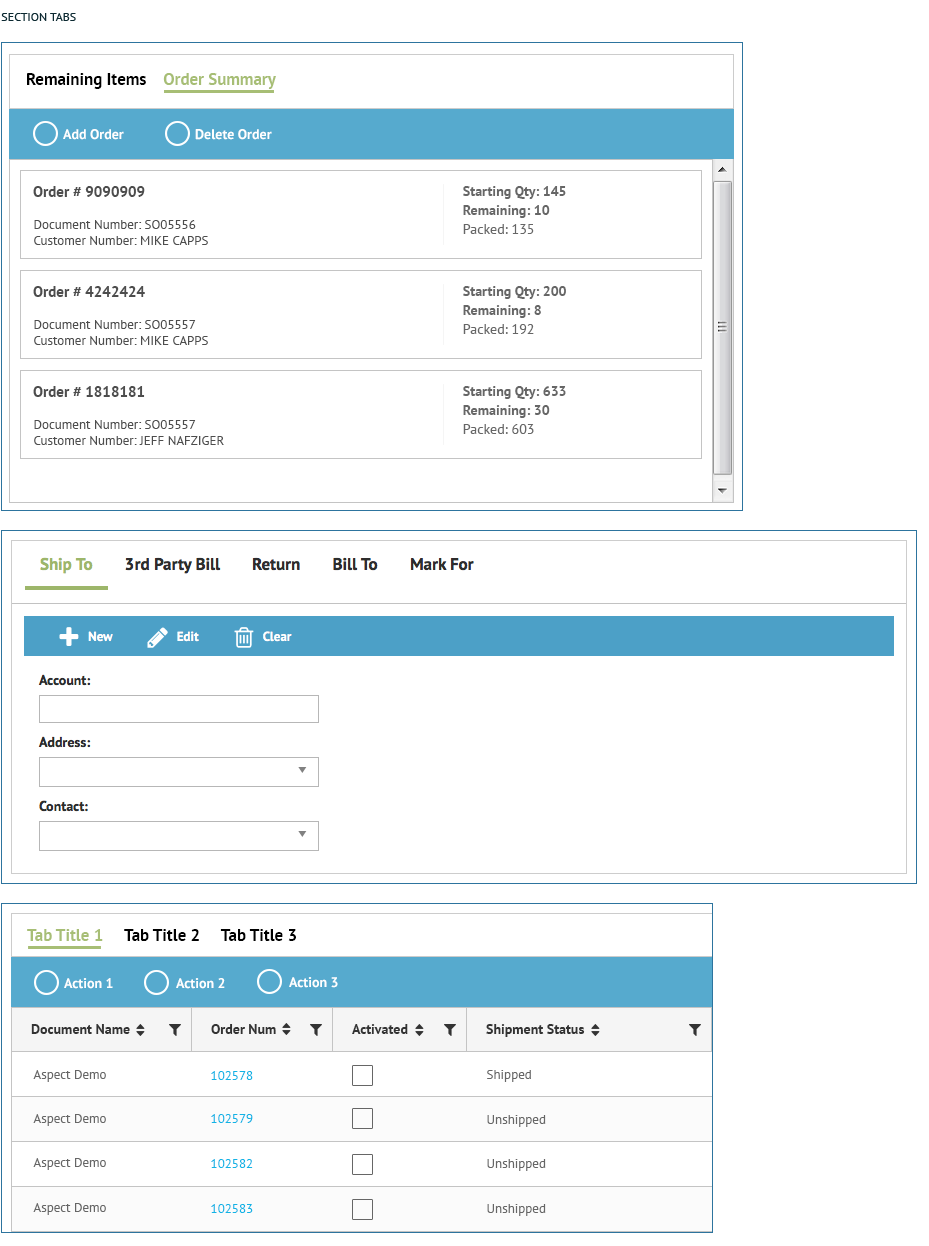
The Section Tabs were created to accommodate for data to be separated further down from the page level.
Implementation
Section Tabs are usually used as part of a grid or for Card data. The selected tab underline should be the same width as the tab text be 5 pixels directly below the text. This treatment should be used for all Section Tabs, unless otherwise specified. Selected Tab underline – height 40px Selected Tab Label – PT Sans Bold, 17px, #8fa65d (Primary 3) Unselected Tab Label – PT Sans Bold, 17px, #000000 (Black)
Colors
Selected Tab underline – #8fa65d (Primary 3)

Wizard Tabs
Description of Function
The Wizard Tabs were created to accommodate a progression that a user needs to complete. They look very much like the standard Page Tabs but have the number added to the tab to indicate which step in the progression the data/forms/setup the user is currently on.
Implementation
The Wizard Tabs are virtually identical to the Page Tabs except for the number that is present on each tab. Tab height – 40px Labels – PT Sans Bold, 14px, #FFFFFF (White) Number Circle – 25 X 25 (px)
Colors
Gray Background color (Unselected) – #CCCCCC (Gray 2)
Green Background color (Selected) – #8fa65d (Primary 3)
Number Circle – #FFFFFF (White)
Unselected Number Text – PT Sans Bold, 16px, #CCCCCC (Gray 2)
Selected Number Text – PT Sans Bold, 16px, #8fa65d (Primary 3)

Instructions Tone
Description of Function
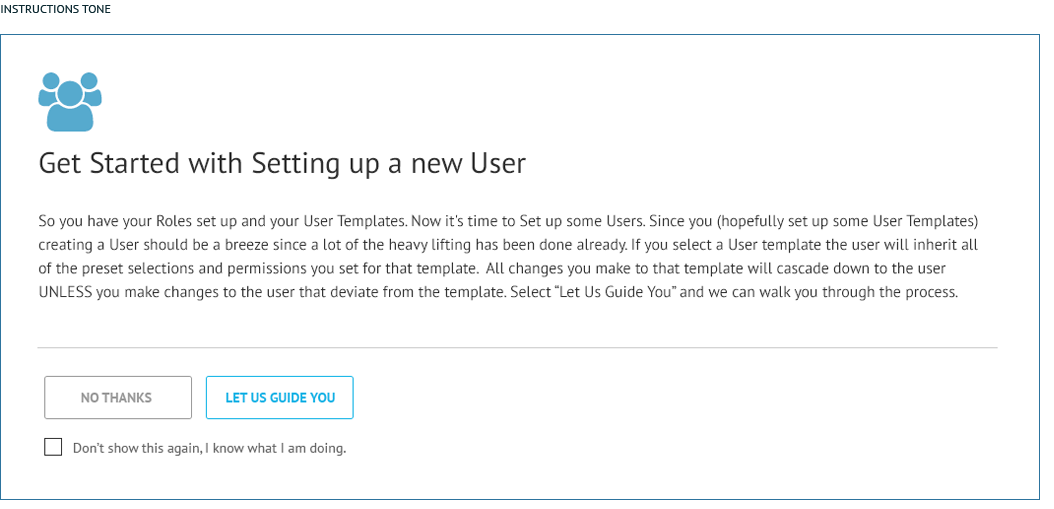
The Instructions tone should be conversational. It should provide the user with enough detail to determine whether they need to follow the Basic or Advanced path. Need additional content from HighJump/TrueCommerce.
Implementation
Always present the user with the checkbox that allows them to opt out of the instructions. The section icon is followed with the Header and then the body copy. A rule separates the content with the on-page buttons. Header text – PT Sans Regular, 30px, #333333 (Gray 7) Main Copy text – PT Sans Regular, 16px, #333333 (Gray 7) Content End Rule – 1px, #CCCCCC (Gray 2)
Icons
User Icon – FontAwesome – fa-users, 60px, #56aace (Primary 4)
User Template Icon – FontAwesome – fa-user-circle, 60px, #56aace (Primary 4)
Role Icon – FontAwesome – fa-address-card, 60px, 60px, #56aace (Primary 4)

Basic vs. Advanced
Description of Function
There are two types of Wizards, Basic and Advanced. The Basic path gives the user instructional text with every step in the process. In addition to that each step in the process is numbered and must be followed in order. The Advanced Wizard does not have the instructions included with each step and they are not numbered and can be completed out of order.
Need additional content from HighJump/TrueCommerce.
Implementation
Always present the user with the checkbox that allows them to opt out of the instructions. The section icon is followed with the Header and then the body copy. A rule separates the content with the on-page buttons. Need additional content from HighJump/TrueCommerce.
Header text – PT Sans Regular, 30px, #333333 (Gray 7)
Main Copy text – PT Sans Regular, 16px, #333333 (Gray 7)
Content End Rule – 1px, #CCCCCC (Gray 2) x, #FFFFFF (White)
Icons
User Icon – FontAwesome – fa-users, 60px, #56aace (Primary 4)
User Template Icon – FontAwesome – fa-user-circle, 60px, #56aace (Primary 4)
Role Icon – FontAwesome – fa-address-card, 60px, 60px, #56aace (Primary 4)

Dashboard Icon (Button)
Description of Function
Need additional content from HighJump/TrueCommerce.
Implementation
Header text – PT Sans Bold
Main Copy text – PT Sans Bold
Icons
User Icon – FontAwesome – fa-users, 60px, #56aace (Primary 4)
User Template Icon – FontAwesome – fa-user-circle, 60px, #56aace (Primary 4)
Role Icon – FontAwesome – fa-address-card, 60px, #56aace (Primary 4)


![]()