Selection Guide
Style 1: Basic Form Page
Style 2: Grid Page
Style 2: Edit Behaviors
Maintenance Page Standard Elements
Standard Elements Include: Title Bar, Menu Bar, Action Bar and a Page Title
At the most basic level a maintenance page layout consists of the title bar, which contains branding, application name, user alerts, help menu, user profile menu, user picture, menu bar navigation, action bar and a page title. There are two styles of maintenance pages, follow this guide to help determine which style to select.
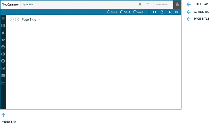
Title Bar
Action Bar
Menu Bar
Selection Guide
Style 1: Basic Form Page:
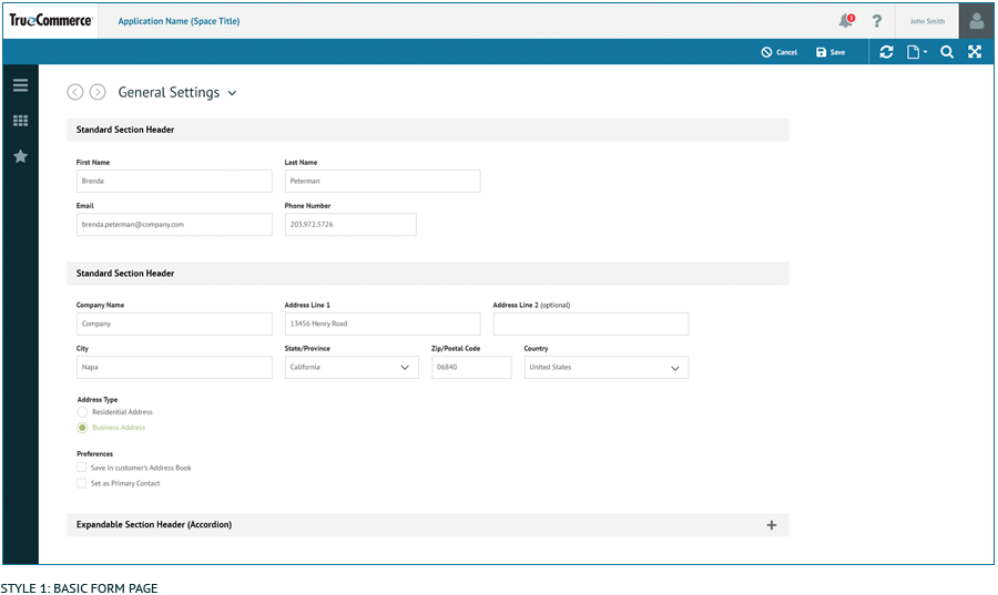
This style of maintenance page should be selected if a simple form is sufficient. Most standard settings pages will fall into this category.
Style 2: Grid Page:
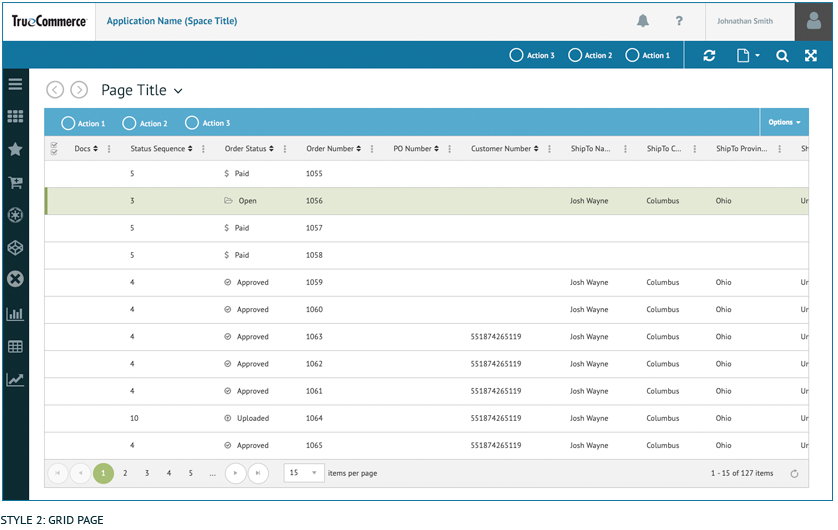
This style of maintenance page should be selected if there is a list of records that a user needs to interact with. The grid page has three styles of edit behavior. When building a grid page the desired edit behavior should be selected based on the data contained within the grid.
Edit Behavior 1: Inline Editing: This edit behavior is for simple grids with small amounts of data. This form of editing is not very mobile friendly and should be avoided if mobile is the primary use case. The user performs edits within the grid rows itself and has the ability to reorder the columns of the grid.
Edit Behavior 2: Single Form Page Editing: This is used for grids with large amounts of data associated with each row and is more user friendly for mobile use cases. When a user selects a row of data to edit, the user is brought to a separate form page to perform the edit. This allows the large amount of data within the grid to be organized in a more user friendly format for editing.
Edit Behavior 3: Wizard & Page Tab Editing: This add/edit behavior is reserved for the more complex scenarios of adding and editing data in a grid. If a user is creating a new record in the grid they will be presented with a wizard that guides them down a forced data entry path. If a user is editing a row of data they will be presented a form with page tabs that allows them to freely click through with no forced path.
Style 1: Basic Form Page
USE GUIDELINES:
This style of maintenance page is a simple one page form. Most standard settings pages will fall into this category.

Page Characteristics
Each Basic Form Page will have standard page elements such as the Menu Bar, Title Bar, Action Bar and Page Title.
- Section Headers
- Expandable Section Headers
- Icon Buttons
Forbidden Page Elements: These controls should never appear on Style 1: Basic Form Page. If the following controls are needed than the page can no longer be classified as a standard maintenance page.
- Page Tabs
- Wizard
- Journey Progression Bar
- Section Tabs
- Status Bar
- Header Summary
- On-Page Buttons With the exception of an icon button which is used for attaching files (image, audio etc.)
- Action Bar: ALL actions in the action bar pertain to the entire page or launch a separate experience (series of pages/wizard). There are a few exceptions to this rule. Two examples of this exception are the actions “Upload” and “Download”. Even though these actions can be taken against a single selected record in a grid or multiple records in a grid, there are use cases where it is applied to entire assets and therefore these actions belong in the action bar.
- Global Page Actions – These actions MUST be present at all times
- Refresh
- Page Options
- Search (Search Panel) All pages should have this control, especially if there are more than 5 pages of data within a grid
- Collapse
- Additional Page Actions – Page actions are application specific. Here is a list of examples of page actions that could appear in the action bar.
- Save
- Cancel
- Return to […]
- Submit
- Settings
- Upload (up arrow)
- Download (down arrow)
- Import
- Export
- Configuration
- Global Page Actions – These actions MUST be present at all times

Style 2: Grid Page
Use Guidelines
This style of maintenance page presents a list of records in a grid that a user will be able to interact with. The grid page has three styles of edit behavior. When building a page the edit behavior should be selected based on the data contained within the grid.

Edit Behavior 1: Inline Editing: This edit behavior is for simple grids with small amounts of data. This form of editing is not very mobile friendly and should be avoided if mobile is the primary use case. The user performs edits within the grid rows itself and has the ability to reorder the columns of the grid.
Edit Behavior 2: Single Form Page Editing: This is used for grids with large amounts of data associated with each row and is more user friendly for mobile use cases. When a user selects a row of data to edit, the user is brought to a separate form page to perform the edit. This allows the large amount of data within the grid to be organized in a more user friendly format for editing.
Edit Behavior 3: Wizard & Page Tab Editing: This add/edit behavior is reserved for the more complex scenarios of adding and editing data in a grid. If a user is creating a new record in the grid they will be presented with a wizard that guides them down a forced data entry path. If a user is editing a row of data they will be presented a form with page tabs that allows them to freely click through with no forced path.
Page Characteristics
Each Basic Form Page will have standard page elements such as the Menu Bar, Title Bar, Action Bar and Page Title.
- Section Headers
- Expandable Section Headers
- Icon Buttons
- Page Tabs
- Wizard
- Journey Progression Bar
- Section Tabs
- Status Bar
- Header Summary
- On-Page Buttons With the exception of an icon button which is used for attaching files (image, audio etc.)
- Page Tabs used on the edit page only
- Tabs used when the “Add” action is selected to create a new record
Page Actions: The basic form page can have page actions and they should be located in the action bar at the top of the page.
-
- Action Bar: ALL actions in the action bar pertain to the entire page or launch a separate experience (series of pages/wizard). There are a few exceptions to this rule. Two examples of this exception are the actions “Upload” and “Download”. Even though these actions can be taken against a single selected record in a grid or multiple records in a grid, there are use cases where it is applied to entire assets and therefore these actions belong in the action bar.
- Global Page Actions – These actions MUST be present at all times
- Refresh
- Page Options
- Search (Search Panel) All pages should have this control, especially if there are more than 5 pages of data within a grid
- Collapse
- Additional Page Actions – Page actions are application specific. Here is a list of examples of page actions that could appear in the action bar.
- Save
- Cancel
- Return to […]
- Submit
- Settings
- Upload (up arrow)
- Download (down arrow)
- Import
- Export
- Configuration
- Global Page Actions – These actions MUST be present at all times
- Sub-Action Bar: ALL actions in the Sub-Action Bar pertain to either a single selected record or multiple selected records in a grid, not the entire page
- Standard Sub-Action Bar Actions (CRUD) – These actions must follow the behavior guidelines explained in greater detail here
- Add – present only when a record in the grid is NOT selected
- View – present only when a record in the grid is selected
- Edit – present only when a record in the grid is selected
- Delete – present only when a record in the grid is selected
- Save – present only when a record in the grid is selected and being edited
- Cancel – present only when a record in the grid is selected and being edited
- Additional Sub-Action Bar Actions – These actions are application specific
- Standard Sub-Action Bar Actions (CRUD) – These actions must follow the behavior guidelines explained in greater detail here
- Options Dropdown Actions – This dropdown is used for any other less commonly used actions that are required for an application
- Action Bar: ALL actions in the action bar pertain to the entire page or launch a separate experience (series of pages/wizard). There are a few exceptions to this rule. Two examples of this exception are the actions “Upload” and “Download”. Even though these actions can be taken against a single selected record in a grid or multiple records in a grid, there are use cases where it is applied to entire assets and therefore these actions belong in the action bar.
-
-
- Standard Options – These actions MUST be present
- Export – Allows the user to export the data within the grid. If the grid has been filtered then only what is viewable in the grid is what will be exported. The export action has no awareness of anything selected in the grid.
- Save Configuration
- Reset Configuration
- Additional Options Dropdown Actions – These actions are application specific
- Standard Options – These actions MUST be present
-


Style 2: Edit Behaviors
Edit Behavior 3: Wizard & Page Tab Editing:
How it Works:
- The user is presented with a grid which will always have a sub-action bar. The standard actions present when no row is selected are “Add” – The user can add a new record. Additional Actions – these actions are application specific and will follow all standard actions.
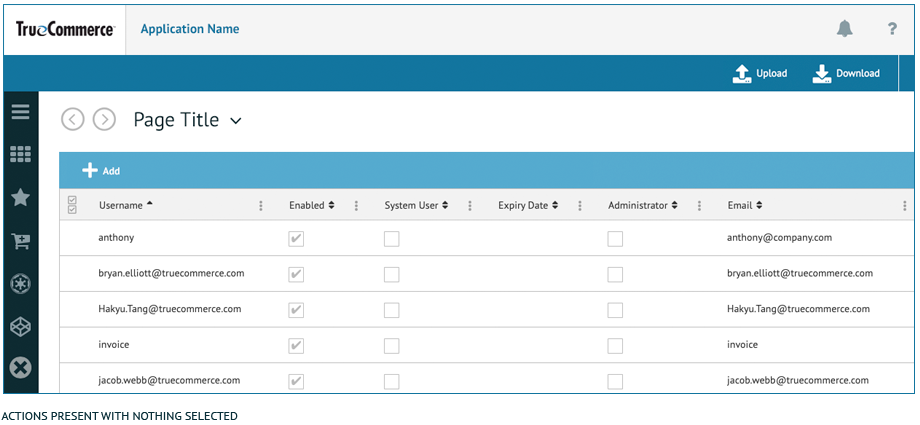
- When a row of data is selected, the background color will turn green (E4E9D5) and there will be a 5 px wide green (8FA65D) rule on the left border of the row. If the user selects only a single row the standard actions that should be visible in the sub-action bar will be the following:
- View – Not all applications support this action. In the event “View” is supported it should come before “Edit” and “Delete”
- Edit
- Delete
- Any additional actions available to the selected row of data will follow all standard actions.

- If the user selects the “EDIT” action in the sub-action bar they will be taken to a separate edit screen which will be a basic form page. The form can have following optional page elements but they are not required: Section Headers, Icon Buttons.


- Once the user is on the edit form page they have the ability to save or discard any changes they make by selecting either “save” or “cancel” in the action bar at the top of the page. The user will then return to the grid page.

- If the user selects the “NEW” action in the sub-action bar they will taken to a separate screen which will be a multi page wizard with numerical page tabs. This wizard will guide the user through ordered steps to complete a new record in the grid.
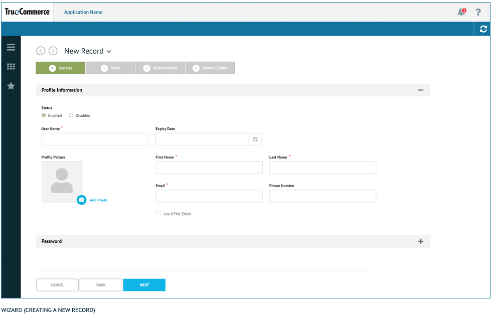
- Once the user is in the “New” wizard workflow they have the ability to complete each step until they reach the final step and save this newly created record – OR – they can select “Cancel” at anytime to abandon this new record and return back to the grid page. Like all wizards, the on-page buttons “Cancel, Back, Next/Finish” can be found at the bottom of each page directly below the content fields.

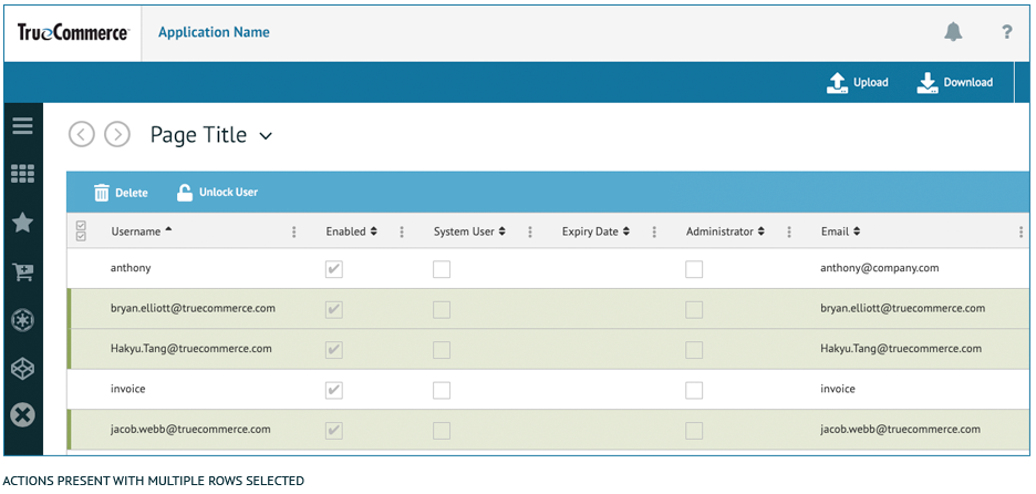
- If the user selects multiple rows of data the edit action will no longer be available unless the application supports Batch Editing. The only standard action that should be visible in the sub-action bar when multiple rows are selected is “Delete”. Additional actions available to the selected rows of data will follow “Delete” in the sub-action bar.
