Action Bar
Description of Function
The Action Bar is near the top of the screen and directly below the title bar. This is where the user can perform all page actions. The actions to the right of the vertical rule are global actions. These can include: Page Settings, Refresh, Page options, Search, and Collapse. The actions to the left of the vertical rule are page actions. There are six “slots” for actions. If the page has more than six actions the more (…) icon appears and the additional icons/actions appear in the more dropdown leaving 5 remaining actions visible.
Implementation
The height of the Action Bar is 50px. The Page icon in the global actions is accompanied by a small dropdown arrow in order to signal to the user that there are options associated with the action. This is different from the standard page actions (Save, Delete, etc.) which are carried out immediately when the user selects the icon and/or action title. In this case, the experience is different and therefore needs a subtle change in iconography.
Standard Page Actions
- Refresh – All data on the page is refreshed with this action.
- Page Options
- Add Page Favorite – places the page in the Favorites section of the left menu bar
- Copy Page URL – copies the URL link to the specific page
- Add Page Quick Link – marks the page as well as its specific parameters and takes the user to the New Quick Link management screen in order to assign an icon (etc.) and save
- Open Page in New Window – opens the current page in a separate window
- Search – opens the search panel on the right of the screen for the user to apply search parameters to the page content
- The search is only present if the content on the page supports the need for this functionality.
- Collapse – removes the header bar from the screen full to allow for more content to be viewed
What NOT to do
- Do NOT use drop downs with the Page Title in the Action Bar
- Do NOT put CRUD (Create, Review, Update, and Delete) Actions in the Action Bar
Colors
Action Bar Background – #12759f (Primary 1)
MouseOver Action Button – #4c91b0 (Secondary 6)
Action Button Lable – PT Sans Bold 14px, #FFFFFF (White)
InActive Action Button Lable – PT Sans Bold 14px, #6fb7d5 (Secondary 11)
Icons
Refresh – FontAwesome, 26px, #FFFFFF (White)
Page Options – Font Awesome, 26px, #FFFFFF (White)
Page Options Dropdown Arrow – FontAwesome, 26px, #FFFFFF (White)
Add Favorite – FontAwesome f005, 26px, #FFFFFF (White)
Copy Page URL – FontAwesome f0c1, 26px, #FFFFFF (White)
Add Page Quick Link – FontAwesome f02e, 26px, #FFFFFF (White)
Open Page in New Window – FontAwesome, 26px, #FFFFFF (White)
InActive Open Page in New Window – FontAwesome, 26px, #6fb7d5 (Secondary 11)
Search – FontAwesome, 26px, #FFFFFF (White)
Collapse – FontAwesome, 26px, #FFFFFF (White)
Addition Actions – FontAwesome variable, 26px, #FFFFFF (White)

Sub-Action Bar
Description of Function
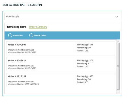
This was added to accommodate for actions that apply directly to the data in a grid or in cards but not to anything else on the page.
Implementation
The height of the Sub-Action Bar is 50px. A Sub-Action Bar should be added for every grid, even if it’s the only grid on a page. It should be used when there are data-specific or grid-specific actions such as Add, Edit, Delete, Save, Cancel and Options. These actions should only be in the Sub-Action Bar and are never in the Action Bar.
Standard Sub-Actions
- Same height and style as the main action bar
- Actions are left aligned
- CRUD (Create, Review, Update, and Delete) Actions
- “Add” function is always visible
- Except if the user does not have permissions to add
- Edit & Delete are visible once a record is selected
- Except if user does not have permission
- Except if the user is in edit mode
- Save/Cancel
- Visible once a record is selected
- “Add” function is always visible
- Button Order
- Add
- Edit
- Delete
- Save
- Cancel
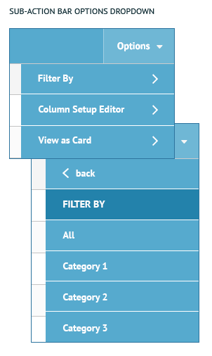
- Options Dropdown
- Options dropdown is anchored to right hand side of grid
- Options should have buttons in this order
- Export
- Save Configuration
- Reset Configuration
What NOT to do
- Do NOT put other actions between CRUD Actions
Colors
Sub-Action Bar Background – #56aace (Primary 4)
MouseOver Sub-Action Button – #6fb7d5 (Secondary 11)
Selected Options Drop down Background – #2382ab (Secondary 10)
Sub-Action Bar Button Lable – PT Sans Bold, 14px, #FFFFFF (White)
Selected Sub-Action Bar Button Lable – PT Sans Bold, 14px, #FFFFFF (White)ALL CAPS
Icons
Options Drop Down Arrow – FontAwesome caret down, 14px, #FFFFFF (White)
CRUD Actions:
Add – FontAwesome, 26px, #FFFFFF (White)
Edit – FontAwesome, 26px, #FFFFFF (White)
Delete – FontAwesome, 26px, #FFFFFF (White)
Save – FontAwesome, 26px, #FFFFFF (White)
Cancel – FontAwesome, 26px, #FFFFFF (White)


Sub-Action Bar Options
Description of Function
Provides the user with multiple ways to view the content on a page.
Implementation
The contents of this menu are determined by each application and the use case of the table.
Standard Options Dropdown Commands
- Filter by – presents data based on predetermined settings
- View as Card/Grid – toggles data view
- Column Setup Editor – shows all column headings associated with the data and gives the user the ability to Show/Hide certain headings as well as placing them in a specific desired order
Additional Options Dropdown Commands
Options should have buttons in this order
- Export
- Save Configuration
- Reset Configuration
Colors
Sub-Action Bar Background – ##56aace (Primary 4)
MouseOver Sub-Action Button – #6fb7d5 (Secondary 11)
Selected Options Drop down Background – #2382ab (Secondary 10)
Sub-Action Bar Button Lable – PT Sans Bold, 14px, #FFFFFF (White)
Selected Sub-Action Bar Button Lable – PT Sans Bold, 14px, #FFFFFF (White) ALL CAPS
Icons
Options Drop Down Arrow – FontAwesome caret down, 14px, #FFFFFF (White)

