User Profile Menu and Account Selection
Description of function
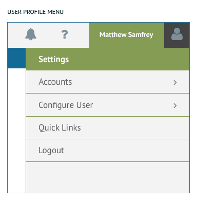
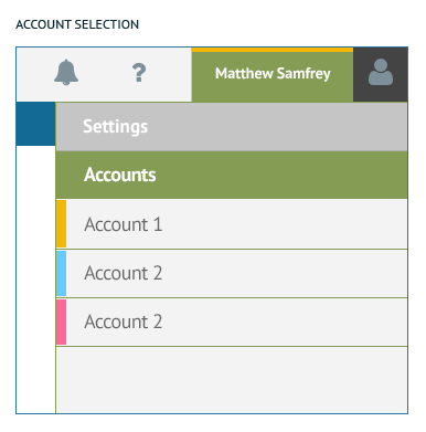
The User Profile and Account Selection menu can be accessed from the user name displayed in the upper right corner of the screen. When the user activates this menu, they will see the User settings along with the Account selection function. User Profile: Configuration of User settings for the The Platform. Account Selection: Signifies which Account the user is currently using.
Implementation
User Profile Menu: This menu includes the User Profile Settings, Configure User function, Quick Links Setup, and Logout function.
Account Selection: This function includes the addition of a 4px height color bar above the name of the user as well as the account title below. It has a similar style treatment to the traditional Profile dropdown with the addition of an Accounts item. Each Account has a pre-assigned color that is shown with a 10px wide bar left aligned with the edge of the dropdown.
Help Dropdown
Description of function
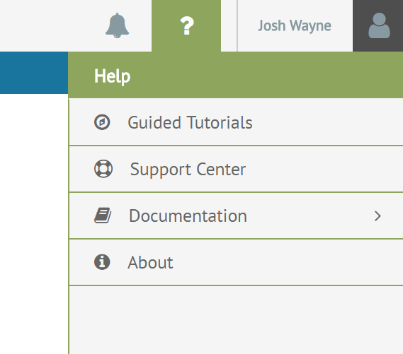
The Help Dropdown is in the upper right portion of the screen directly in-between the Alerts icon and the Profile Dropdown. App-specific help sections will appear in this menu.
Implementation
Height of 44px and always shown as the first section at the top of the Help Dropdown with menu selections shown below.
Icons
Help icon – FontAwesome f128, 36px, #889ba3 (Secondary 50)
MouseOver Help icon – FontAwesome f128, 36px, #FFFFFF (White)
Page Search
Description of function
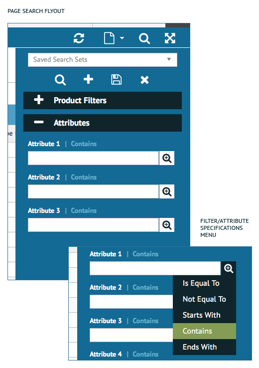
The Page Search Flyout is in the upper right portion of the screen in the Action Bar if the page calls for a search. The user can expand and collapse the bucketed sections to customize the search as they see fit. The zoom magnifying glass allows the user to be even more specific with the search specifications. Page Searches are conducted here. When the user clicks on the search icon in the Action Bar the Search Flyout is launched.
Implementation
This UI element needs to be present on every page where data can be searched or filtered. Height of 44px and always shown as the first section at the top of the Help Dropdown with menu selections shown below.
Colors
Flyout Background – #12759f (Primary 1)
Text Entry Rule – #b3b3b3 (Gray 3)
Text – PT Sans Regular, 14px, #666666 (Gray 5)
Focus Rule – #8fa65d (Primary 3)
Filter/Attribute Labels – PT Sans Bold, 14px, #FFFFFF (White)
Filter Specifications Label – PT Sans Bold, 14px, #56aace (Primary 4)
Filter Specifications Menu Background – #0c2931 (Primary 2)
Filter Specifications Menu Selection – #8fa65d (Primary 3)
Filter Specifications Menu Text – PT Sans Regular, 16px, #FFFFFF (White)
Icons
Search – FontAwesome f002, 24px, #FFFFFF (White)
Save Search – FontAwesome f0c7, 24px, #FFFFFF (White)
Add – FontAwesome f067, 24px, #FFFFFF (White)
Clear Search – FontAwesome f00d, 24px, #FFFFFF (White)
Filter/Attribute Specification – FontAwesome f00e, 24px, #FFFFFF (White)

Description of function
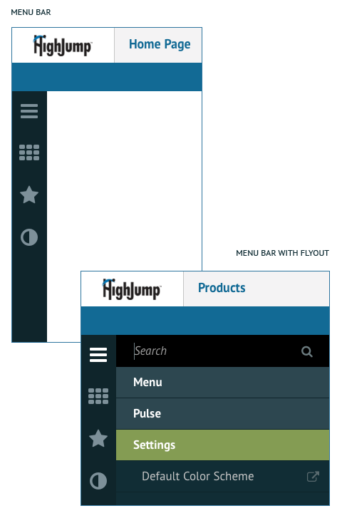
The Menu Bar is located on the left side of the screen and is the primary method for navigating within and between applications on the The Platform. Platform settings are also found in the Menu Bar. All of the Primary icons are located within this bar. These icons include the Main Menu, Spaces, Favorites, Quick Links, and Settings. A Menu Search is present at the top of the Menu Bar Flyout which is launched when the user clicks on the Main Menu, Spaces or Favorites. There is no flyout on Quick Links.
Implementation
Menu bar width is 50px and is opened and closed with a click action. The Main Menu icon is always the top item in the Menu Bar followed by Spaces, Favorites, Quick Links and Settings is anchored to the bottom of Menu Bar.
Colors
Menu Bar:
Menu Bar Background – #0c2931 (Primary 2)
Menu Bar Icons – #889ba3 (Secondary 5)
MouseOver Menu Bar Icons – FontAwesome, 30px, #FFFFFF (White)
Flyout:
Menu Background – #0f333d (Secondary 8)
MouseOver Menu Background – #33515a (Secondary 9)
Search Text – PT Sans Italic, 17px, #889ba3 (Secondary 5)
Search BG – #000000 (Black)
UnSelected Menu Items – PT Sans Regular, 17px, #666666 (Gray 5)
Selected Menu Item – PT Sans Bold, 17px, #FFFFFF (White)
Selected Menu Item Background – #8fa65d (Primary 3)
Previous Level Menu Item Background – #33515a (Secondary 9 )
Icons
Search Icon – FontAwesome f002, 24px, #889ba3 (Secondary 5)

Main Menu (Bars Icon)
Description of function
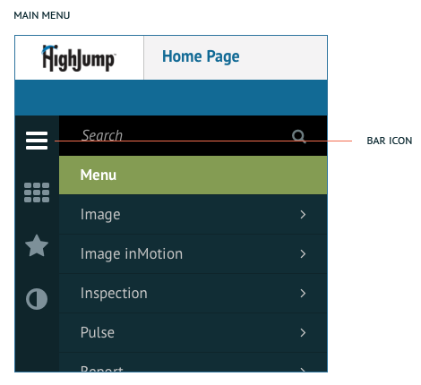
The Main Menu is located on the left side of the screen inside the Menu Bar and is visually represented by the FontAwesome bars icon. The Main Menu contains all the applications loaded into the The Platform and the Menu Search.
Implementation
The Main Menu icon is always the top item in the Menu Bar followed by Spaces.
Colors
Icons
Bar Icon – FontAwesome f0c9, 30px, #889ba3 (Secondary 5)
Selected/MouseOver
Bar Icon – FontAwesome f0c9, 30px, #FFFFFF (White)
Spaces (th Icon)
Description of function
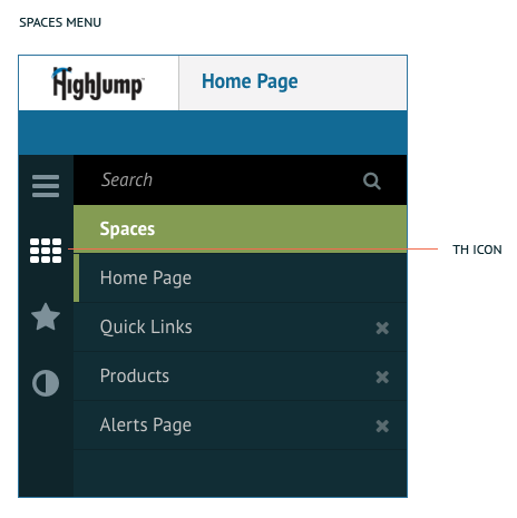
The Spaces Menu is located on the left side of the screen and inside the Menu Bar and is visually represented by the th icon. Spaces are all of the applications and pages you have open in the current session on the The Platform. This allows the user to quickly jump back and forth between different tasks they are trying to accomplish.
Implementation
The Spaces Menu icon is always right below the Main Menu in the Menu Bar followed by Quick Links.
Colors
See Menu Bar
Icons
th Icon – FontAwesome f0c9, 30px, #889ba3 (Secondary 5)
Selected/MouseOver
th Icon – FontAwesome f00a, 30px, #FFFFFF (White)
Favorites (Star Icon)
Description of function
Favorites provide a quick way for users to access specific information. They are located on the left side of the screen and inside the Menu Bar. When a page is made a favorite, the user will receive a toast notification letting them know.
Implementation
Favorites are right after the Spaces Menu icon but before Quick Links.
Colors
Icons
Favorites Icon – FontAwesome f005, 30px, #889ba3 (Secondary 5)
Selected/MouseOver
Favorites Icon – FontAwesome f005, 30px, #FFFFFF (White)
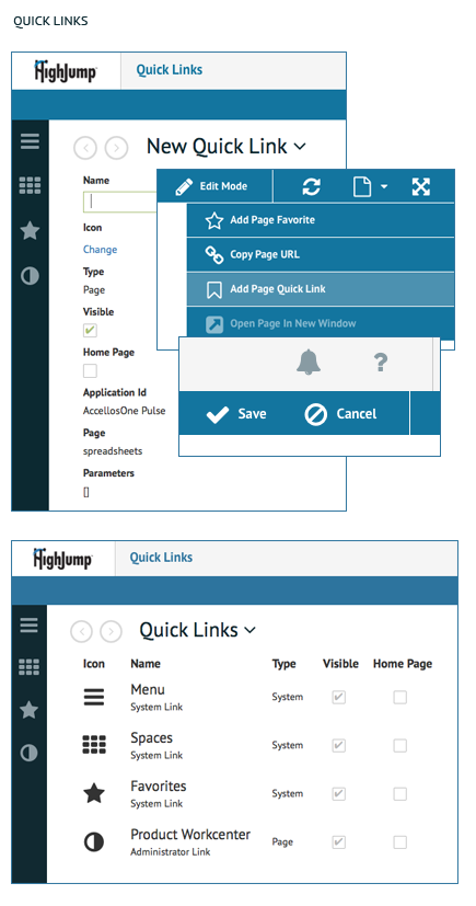
Quick Links (User Selected Icons)
Description of function
Quick Links provide a quick way for users to access specific information. The icons are selected by the user to represent the information the user would like to have access to. They are located on the left side of the screen and inside the Menu Bar.
Implementation
Quick Links are right after the Spaces Menu icon and are set-up in User profile menu in the upper right corner of the screen. We recommend a strict limit of 4 Quick Links that can be added to the left Menu bar, this limit is made to account for the visual spacing that is needed on smaller desktop viewports. The limit of 4 Quick Links is considered with the addition of the Status Bar as well.
Colors
Icons
User Selected Quick Links – FontAwesome, 30px, #889ba3 (Secondary 5)
Selected/MouseOver
User Selected Quick Links Icon – FontAwesome, 30px, #FFFFFF (White)
User Alerts
Description of Function
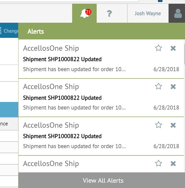
Provides the user with badge notifications in the header bar indicating how many alerts the user has. When the user clicks on the icon the Alert Dropdown shows the most recent 3 alerts.
Implementation
On-screen alerts are part of the Platform alerting services, and are used to notify a user of something that needs their attention while they are interacting within the software. Alerts should be used only when attention is needed. They will be visible in the list until the user clears them. The “X” icon deletes the alert, the “Star” icon flags the alert. In the alert preview the application name is always listed – the app/service that triggered the alert. The “payload header” which is like a subject line is always in bold typeface. Underneath that is the brief message (we define 2 different messages within an alert.) This is basically the preview of the message which can be totally different than the body of the alert. When you click on it you can see the full details of the alert. The details screen looks similar to the preview, the same app name and payload header. The big difference is that the body of the message is entirely different than the preview.
Colors
Dropdown Alerts Label – PT Sans Bold, 17px, #FFFFFF (White) ALL CAPS
Sender Name Text – PT Sans Regular, 17px, #999999 (Gray 4)
Title Text – PT Sans Bold, 15px, #333333 (Gray 7)
Message Preview Text – PT Sans Regular, 14px, #999999 (Gray 5)
View All Messages Text – PT Sans Regular, 15px, #FFFFFF (White)
Background gray – #f5f5f5 (Gray 1)
View all Messages Background gray – #999999 (Gray 4)
Green – #8fa65d (Primary 3)
Yellow – #f4b803 (Secondary 13)
Red – #f92f39 (Secondary 3)
Icons
Solid Flag- FontAwesome f024, 22px, #666666 (Gray 5)
Outline Flag – FontAwesome f024, 30px, #FFFFFF (White)
rash Can – FontAwesome f1f8, 30px, #FFFFFF (White)

Status Bar
Description of Function
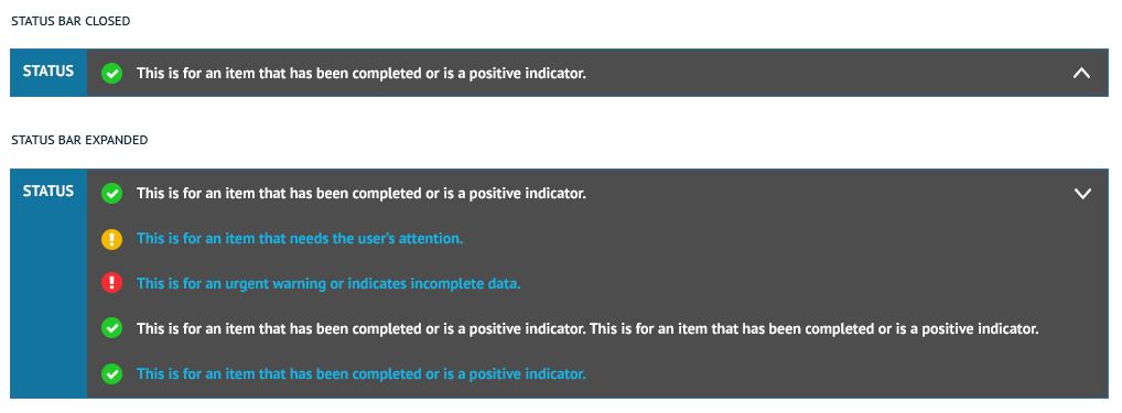
Provides the user with a path to specific content related to the status in order to quickly view or resolve the instance.
Implementation
Similar to alerts, they should be used sparingly as to not overwhelm the user. Status bar notifications are used to publish the results of an asynchronous event initiated by a user within the interactive user experience. They should not be used to display the results of events the user did not directly trigger.
Colors
Background blue – #12759f (Primary 1)
Background gray – #4d4d4d (Gray 6)
Green – #21ca29 (Secondary 12)
Yellow – #f4b803 (Secondary 13)
Red – #f92f39 (Secondary 3)
Text – PT Sans Bold, 14px, #FFFFFF (White)
Linked Text – #11b4e6
Status Label – PT Sans Bold, 14px, #FFFFFF (White) ALL CAPS
Icons
Checkmark – FontAwesome f00c, 14px, #FFFFFF (White)
Exclamation Point – FontAwesome f12a, 14px, #FFFFFF (White)
Alternating Row Color
Description of Function
Allows users to better visually differentiate between rows of data on large grids while scrolling or selecting.
Implementation
This treatment should be used for all grids, unless otherwise specified.
Colors
Gray background color – #fbfbfb (Gray 8)

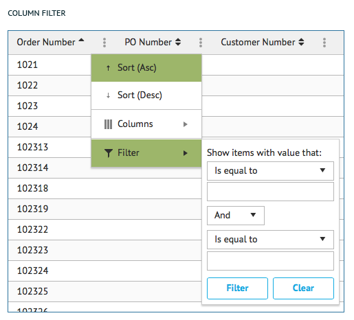
Column Filter
Description of Function
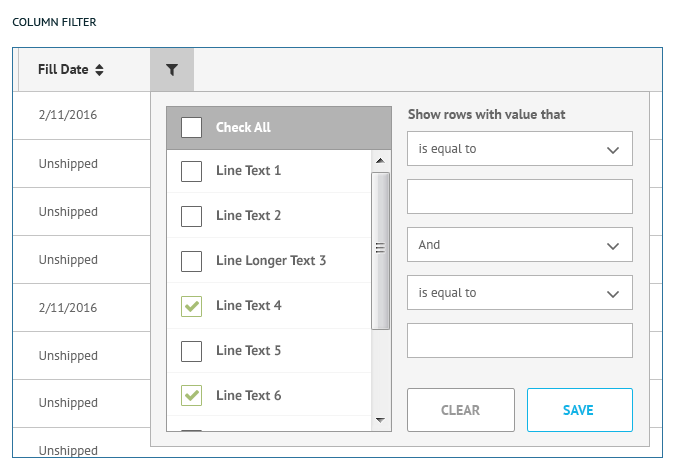
Enables the user to filter the data rows according to specific criteria.
Implementation
Example of two types of filtering options for a column:
- Show/Hide of specific information
- Data values/ranges
Follows basic form, check box and button styling.
Colors
NOTE: Need to establish which style is correct.
Footer
Description of function
Need text from HighJump/TC
Implementation
Need text from HighJump/TC
Colors
Size – 50px tall
Background color – #eaeaea (Gray 9)
First, Last, Back, Next button Rule – #CCCCCC (Gray 2)
First, Last, Back, Next button Fill – #f5f5f5 (Gray 1)
Page selected number – PT Sans Bold, 14px, #FFFFFF (White)
Page unselected number – PT Sans Bold, 14px, #666666 (Gray 5)
Page selected Fill – #8fa65d (Primary 3)
Items per page dropdown text – PT Sans Bold, 14px, #666666 (Gray 5)
Items per page dropdown rule – 1px, #CCCCCC (Gray 2)
Items per page label – PT Sans Bold, 14px, #666666 (Gray 5)
Item total counter – PT Sans Bold, 14px, #666666 (Gray 5)
Icons
Back, Next button arrow – FontAwesome – caret-left, caret-right, 14px, #999999 (Gray 4)
First, Last, button arrow – FontAwesome – step-forward, step-backward, 14px, #999999 (Gray 4)
Items per page arrow – FontAwesome caret down, 14px, #999999 (Gray 4)
Reload – FontAwesome??, ??px, #999999 (Gray 4)

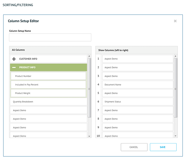
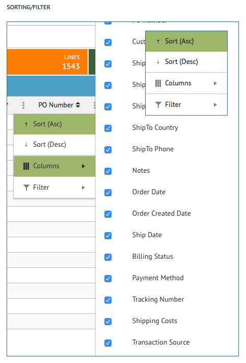
Sorting/Filtering
Description of Function
Need text from HighJump/TC
Implementation
Need text from HighJump/TC
Colors
Need text/styles from HighJump/TC
Icons
Need text/styles from HighJump/TC

Editable Grid
Description of Function
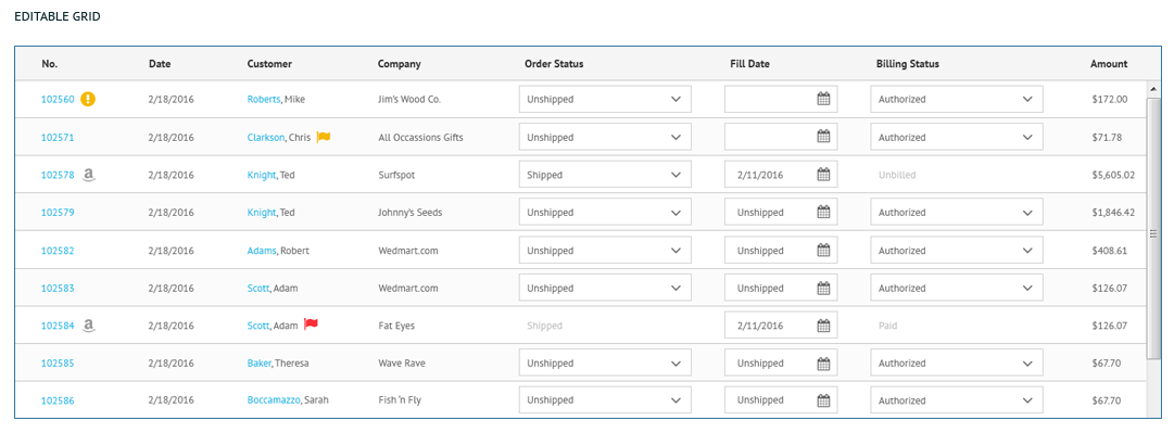
This is used when the data fields in every row are fully editable.
Implementation
Boxes and icons (down arrow, calendar, etc.) are shown according to the type of data, rows are 47px in height to accommodate for the edit boxes.
Colors
Grid Header Background color – #F5F5F5 (Gray 1)
Grid Header Rule – #CCCCCC (Gray 2)
Grid Header Text – PT Sans Bold, 13px, #333333 (Gray 7)
Grid Text – PT Sans Regular, 14px, #666666 (Gray 5)(paragraph)
Icons
Sort Arrows – FontAwesome??, ??px, #333333 (Gray 7)
Filter – FontAwesome ??, ??px, #333333 (Gray 7)
Ellipse – Font Awesome ??, ??px, #999999 (Gray 4)
Date Picker – FontAwesome??, ??px, #?????? (??)(paragraph)
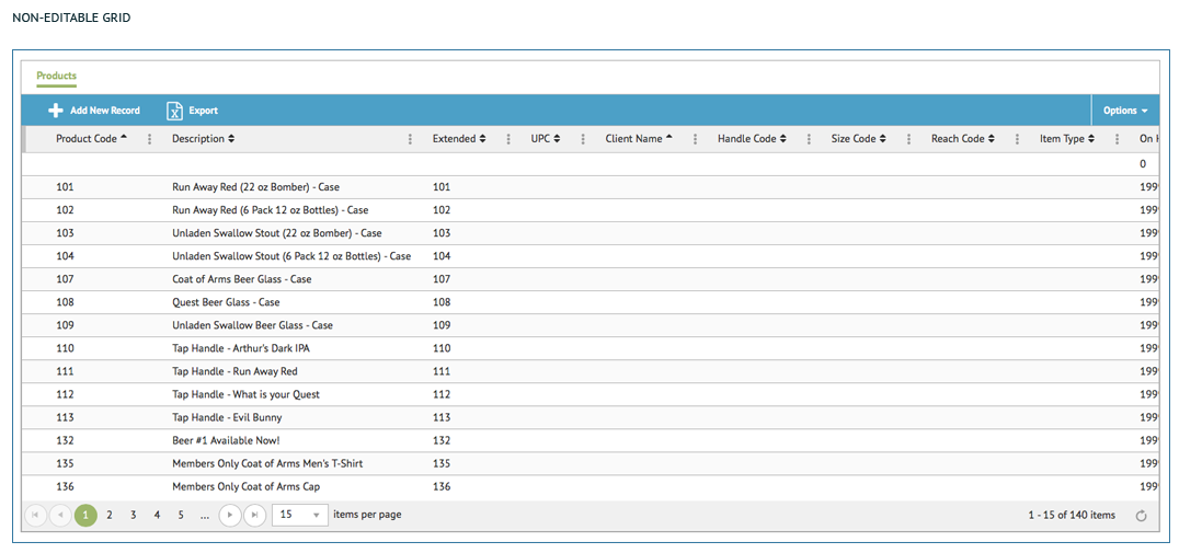
Non-Editable Grid
Description of Function
This is used when the rows are not editable (or at least not initially).
Implementation
Standard style of tables, rows are 44px in height (unless there is an action/option to edit, which would expand the row height to 47px and show styling from the previous slide).
Colors
Grid Header Background color – #F5F5F5 (Gray 1)
Grid Header Rule – #CCCCCC (Gray 2)
Grid Header Text – PT Sans Bold, 13px, #333333 (Gray 7)
Grid Text – PT Sans Regular, 14px, #666666 (Gray 5)
Selected Row Background color – #e4e9d5 (Secondary 2)
Selected Row Indicator Rule – 5px width, #8fa65d (Primary 3)
Icons
Sort Arrows – FontAwesome??, ??px, #333333 (Gray 7)
Filter – FontAwesome ??, ??px, #333333 (Gray 7)
Ellipse – Font Awesome ??, ??px, #999999 (Gray 4)
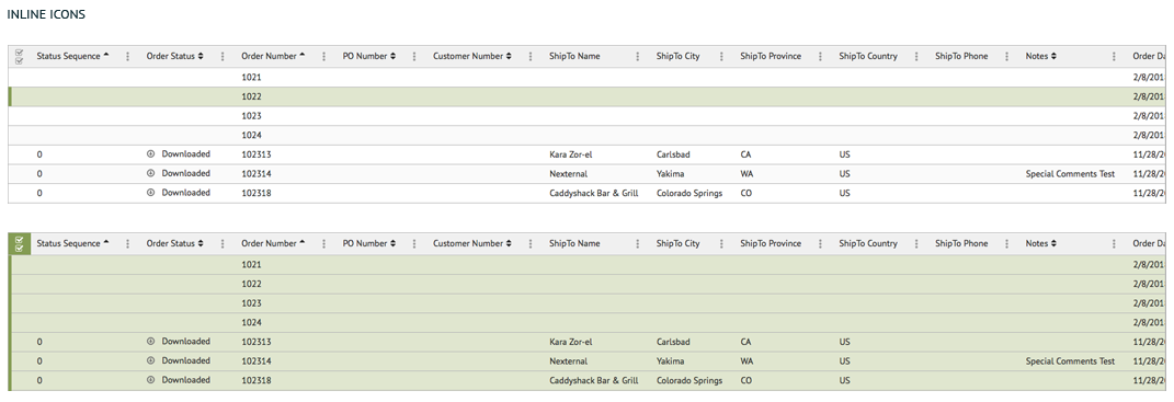
Inline Icons
Description of Function
There is a need for a more modern look and feel for the workcenter pages. To accomplish this, icons and colors are used. This allows the data to be more visual and quicker to understand. The same color palette is used for the icons that is used across other pages. Having too many icons and colors on a grid can cause the information to be hard to read and understand. It is recommended to use these icons and colors sparingly and mixed in with columns of regular text.
Implementation
- Dashboard Callouts – Important information/stats can be called out in section above grid. The data displayed here should be related to the grid below.
- Grid – Icons and color are used to add visual interest and make data easier to understand.
Colors
NOTE: Need styles from HighJump/TC
Icons
NOTE: Need style/icons from HighJump/TC

Multi-Select Rows
Description of Function
This is used when the rows are not editable (or at least not initially).
Implementation
Standard style of tables, rows are 44px in height (unless there is an action/option to edit, which would expand the row height to 47px and show styling from the previous slide).
Colors
Grid Header Background color – #F5F5F5 (Gray 1)
Grid Header Rule – #CCCCCC (Gray 2)
Grid Header Text – PT Sans Bold, 13px, #333333 (Gray 7)
Grid Text – PT Sans Regular, 14px, #666666 (Gray 5)
Selected Row Background color – #e4e9d5 (Secondary 2)
Selected Row Indicator Rule – 5px width, #8fa65d (Primary 3)
Icons
Sort Arrows – FontAwesome??, ??px, #333333 (Gray 7)
Filter – FontAwesome ??, ??px, #333333 (Gray 7)
Ellipse – Font Awesome ??, ??px, #999999 (Gray 4)
Multi Select Checkboxes – FontAwesome??, ??px, #999999 (Gray 4)

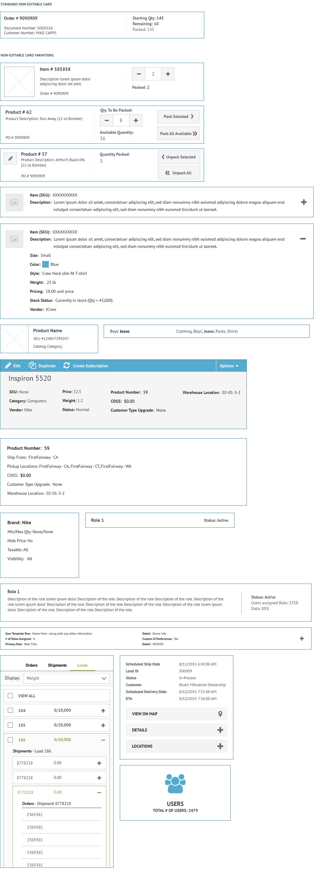
Card Styles
Description of Function
The standard card is a visual way to contain data outside of a grid. The two main types of cards are Non-Editable and Editable. There are many variations of the Non-Editable card.
Need additional content from HighJump/TrueCommerce.
Non-Editable Cards
Description of Function
NOTE: Need content from HighJump/TrueCommerce.
Implementation
NOTE: Need text from HighJump/TrueCommerce.
Image Size 1 – 100 X 100 (px)
Image Size 2 – 60 X 60 (px)
Square Button Size (decrease, increase, edit) – 44 X 44 (px) Stroke – 1px, #CCCCCC (Gray 2)
Rectangle Buttons Size (Pack, Unpack) – 140 X 4 (px) Stroke – 1px, #CCCCCC (Gray 2)
Counter Size – 55 X 44 (px) Stroke – 1px, #CCCCCC (Gray 2)
Colors
Header Text (Left) – PT Sans Bold, 15px, #4d4d4d (Gray 6)
Data Text (Left) – PT Sans Regular, 13px, #4d4d4d (Gray 6)
Sub-set Header Text (Right) – PT Sans Bold, 14px, #666666 (Gray 5)
Sub-set Data Text (Right) – PT Sans Regular, 14px, #666666 (Gray 5)
Verticle Rule Divider – 1px wide, 60 px tall, #f5f5f5 (Gray 1)
Card Border Rule – 1px, #CCCCCC (Gray 2)
Button Background – #f5f5f5 (Gray 1)
Button text – PT Sans Bold, 14px, #666666 (Gray 5)
Counter text – PT Sans Regular, 18px, #666666 (Gray 5)
Icons
Edit – FontAwesome pencil-alt, 17px, #666666 (Gray 5)
Decrease – Font Awesome minus, 17px, #666666 (Gray 5)
Increase – FontAwesome plus, px, #666666 (Gray 5)
Pack Selected arrow – FontAwesome chevron-right, px, #666666 (Gray 5)
Pack All arrow – FontAwesome angle-double-right, px, #666666 (Gray 5)
Unpack Selected arrow – FontAwesome chevron-left, px, #666666 (Gray 5)
Unpack All arrow – Font Awesome angle-double-left, px, #666666 (Gray 5)
There could be additional card variations. Need information from HighJump and TrueCommerce.

Editable Cards
Description of Function
NOTE: Need additional content from HighJump/TrueCommerce.
Implementation
NOTE: Need text from HighJump/TrueCommerce.
Header size – 40px tall
Rules – 1px, #CCCCCC (Gray 2)
Colors
Gray header background color – #fbfbfb (Gray 8)
Header Text – PT Sans Bold, 18px, #FFFFFFF (White) ALL CAPS
Data Header Text – PT Sans Bold, 13px, #666666 (Gray 5)
Data Text – PT Sans Regular, 13px, #666666 (Gray 5)

Icons
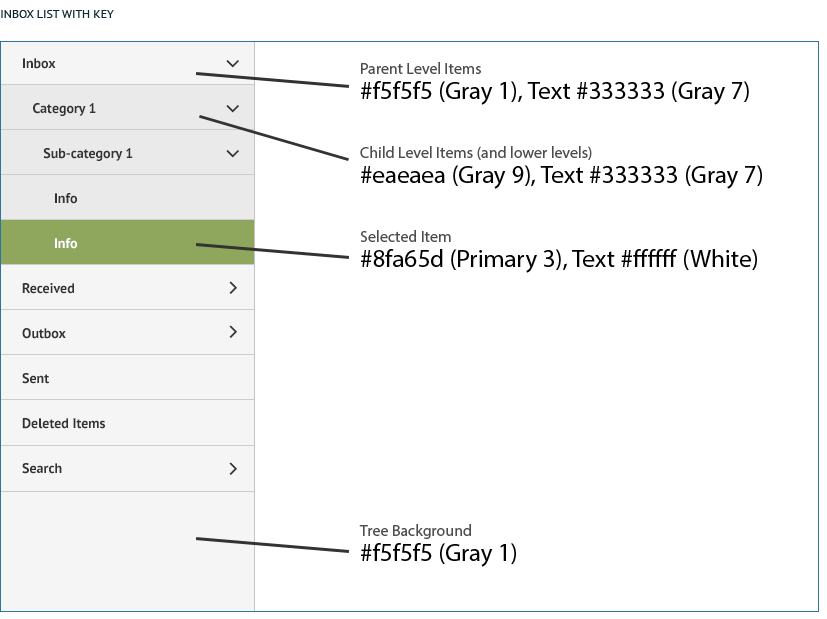
Inbox List Tree View
Description of Function
Enables users to navigate through multiple levels of information on the left, which will change the information in the grid on the right.
Implementation
When a section is collapsed, the arrow points to the right. When a section is expanded, the arrow points down and the background color of items below changes to a darker gray.
Colors
Tree view background (parent items) – #f5f5f5 (Gray 1), Text #333333 (Gray 7)
Child items (and lower level) background – #eaeaea (Gray 9), Text #333333 (Gray 7)
Selected item – #8fa65d (Primary 3), Text #ffffff (White)

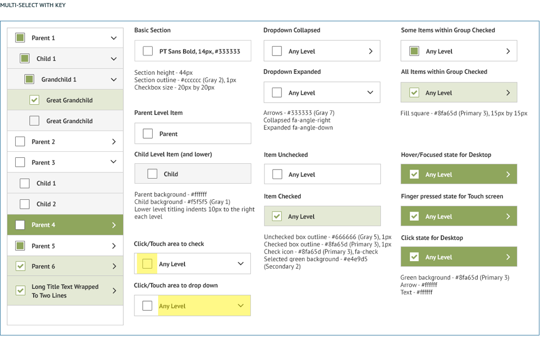
Multi-Select Tree View
Description of Function
Provide the user with a way to filter and choose content by selecting multiple categories or criteria from a tree structure.
Implementation
Should clearly show which sections have some items selected vs. all items selected.
Colors
Child (or lower level) background – #f5f5f5 (Gray 1)
Item checked green background – #e4e9d5 (Secondary 2)
Hover/touch/click state background – #8fa65d (Primary 3)
Text – #333333 (Gray 7)

Description of Function
NOTE: Need content from HighJump/TrueCommerce.
Implementation
NOTE: Need content from HighJump/TrueCommerce.
Colors
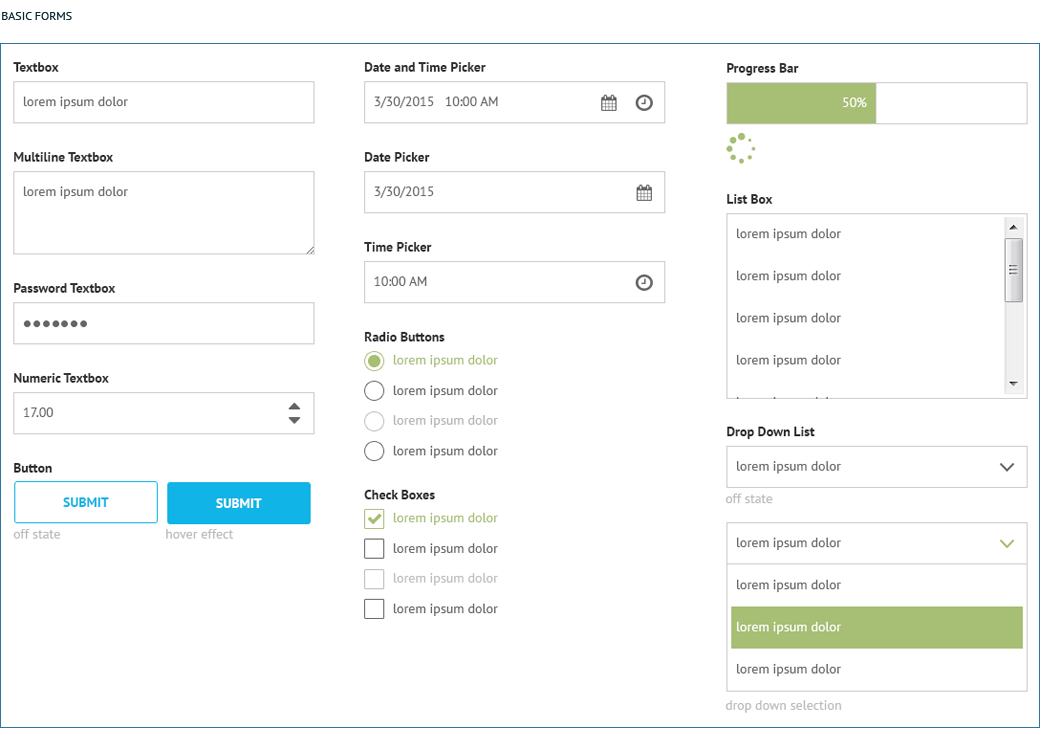
Label Text – PT Sans Bold, 14px, #333333 (Gray 7)
Textbox Data – PT Sans Regular, 14px, #666666 (Gray 5)
Disabled Radio Button Label – #b3b3b3 (Gray 3)
Item checked green background – #e4e9d5 (Secondary 2)
Hover/touch/click state background – #8fa65d (Primary 3)
Icons
Date Picker – FontAwesome fa-calendar, 20px, #666666 (Gray5)
Time Picker – FontAwesome fa-clock-o, 20px, #666666 (Gray5)
Up/Down Carets (Numeric textbox) – FontAwesome fa-caret-down, fa-caret-up
In-Active Angle Down (Dropdown arrow) – fa-angle-down 26px, #666666 (Gray 5)
Active Angle Down (Dropdown arrow) – fa-angle-down 26px, #8fa65d (Primary 3)

Disabled Forms
Description of Function
NOTE: Need content from HighJump/TrueCommerce.
Implementation
NOTE: Need content from HighJump/TrueCommerce.
Colors
NOTE: Need content from HighJump/TrueCommerce.
Image: NOTE: Need content from HighJump/TrueCommerce.
Edited but not Saved
Description of Function
NOTE: Need content from HighJump/TrueCommerce.
Implementation
NOTE: Need content from HighJump/TrueCommerce.
Colors
Edited Yellow – #f4b803 (Secondary 13)
See: Grids, Basic Forms, Standard UI Elements


![]()
